CorePower Yoga
Rebrand · Native App
Project Components
Logo Design
Brand Design
Digital Design
UX + UI




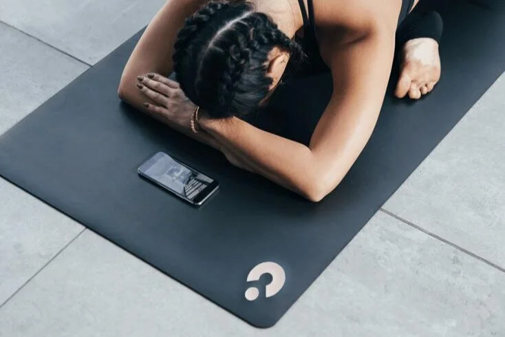
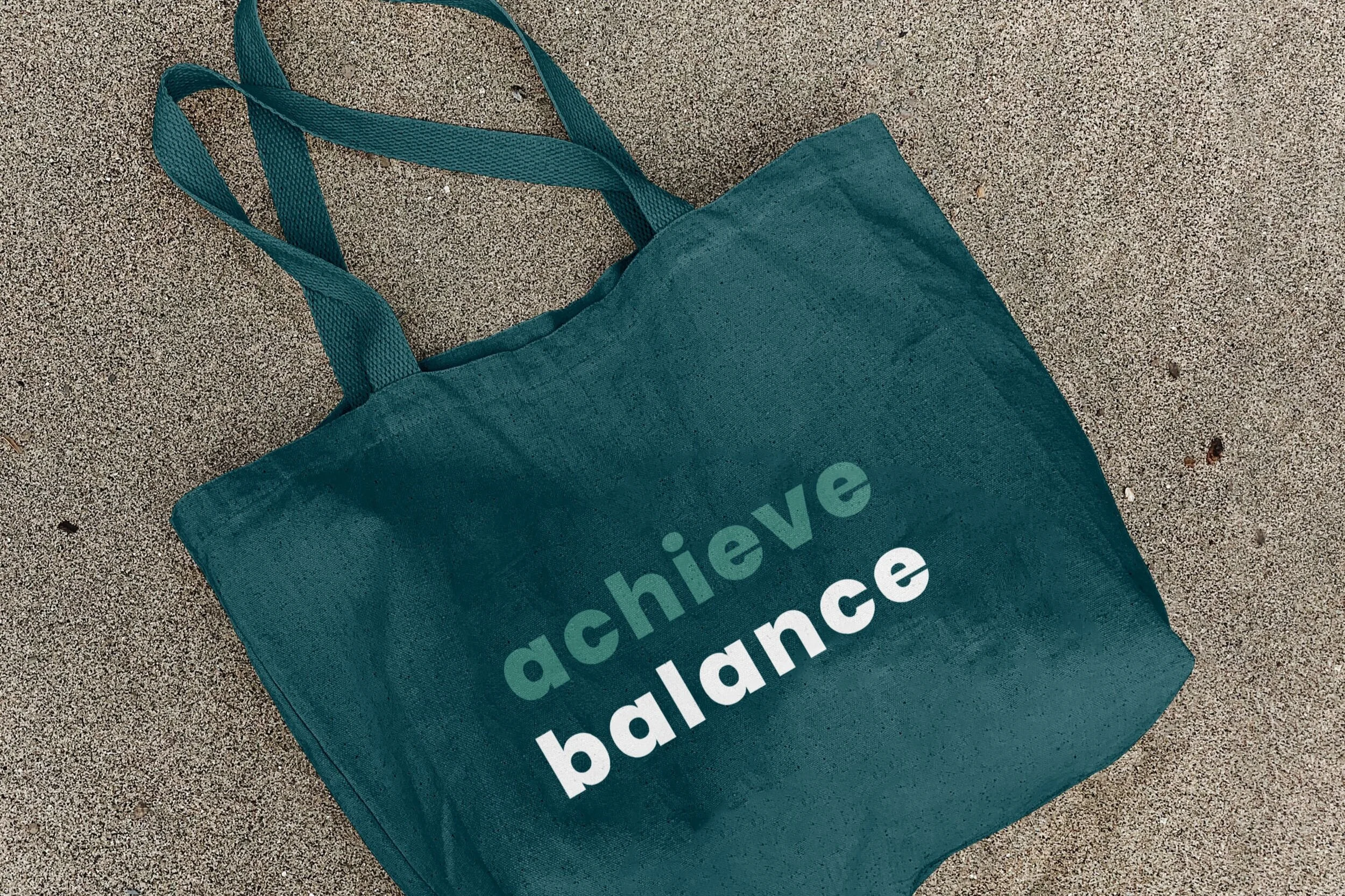
Westin Hotels and Resorts · Binny’s Beverage Depot · CorePower Yoga · Umbro · The Infatuation · Logos
Context
With over 200 locations, CorePower Yoga (CPY) is the largest yoga studio chain in the US. As yoga culture has grown exponentially over the past 20 years, several competitor brands have come up, replicating the CPY model, while CPY itself has remained largely the same.
Objective
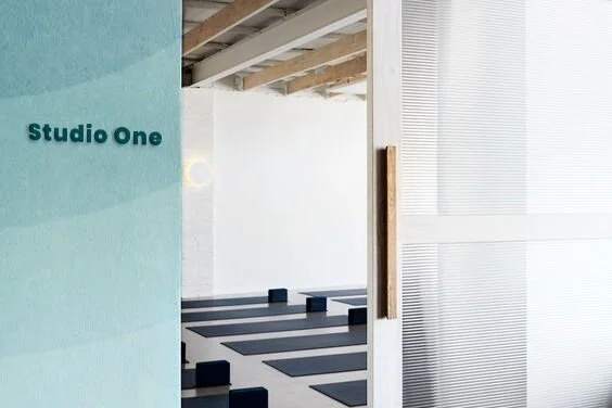
With its ability to offer a relatively consistent experience, its mass of locations, and its forgiving yoga philosophy, CPY remains the most convenient option in yoga studios, especially for first time yogis. A focus on entry to yoga by using elemental shape language honors and more clearly represents the brand’s target audience. By letting go of the original qualities that made it different and leaning in to the one thing that truly sets it apart from the rest – access – CorePower Yoga will reignite its relevance in the yoga studio marketplace.

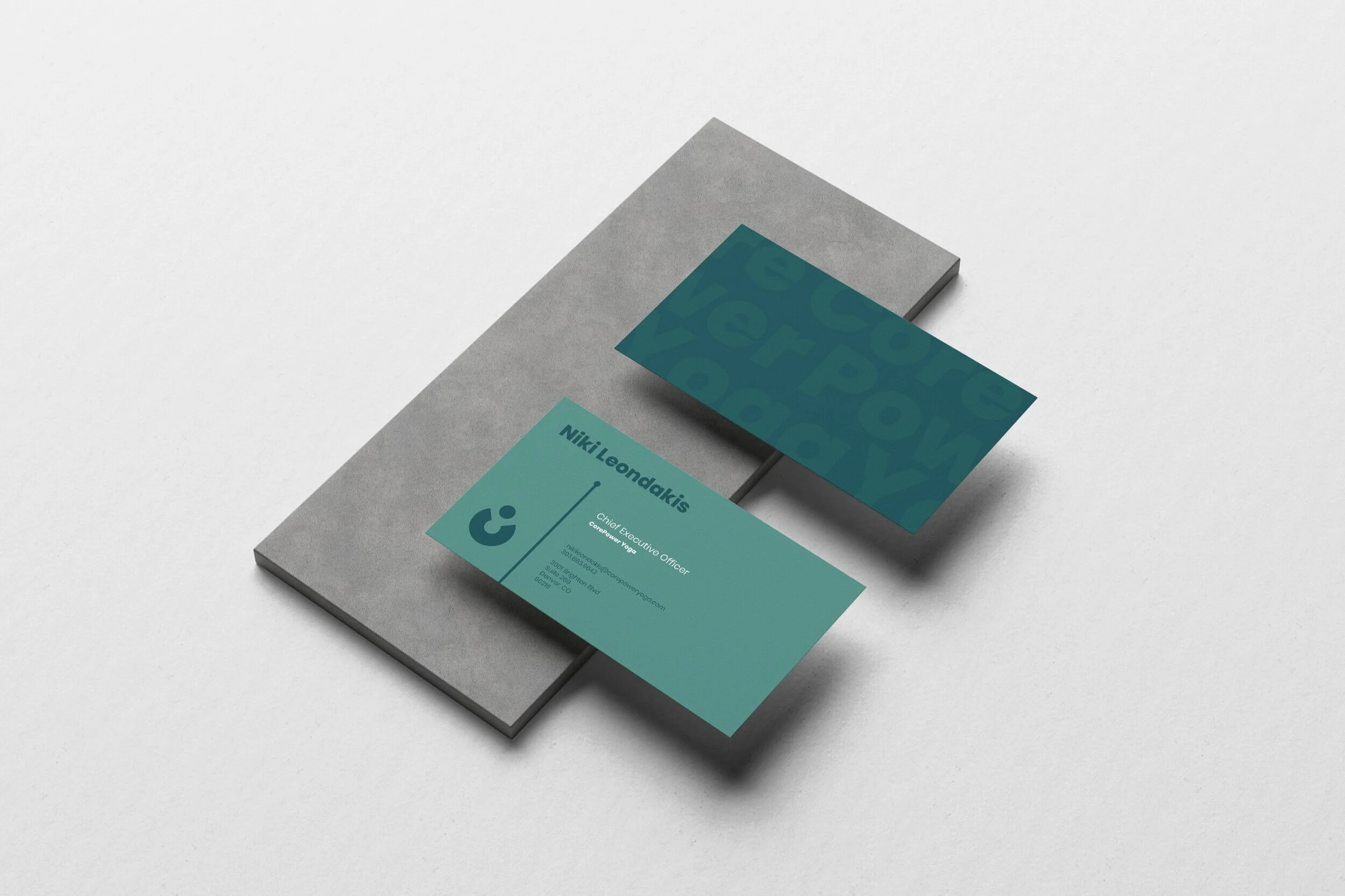
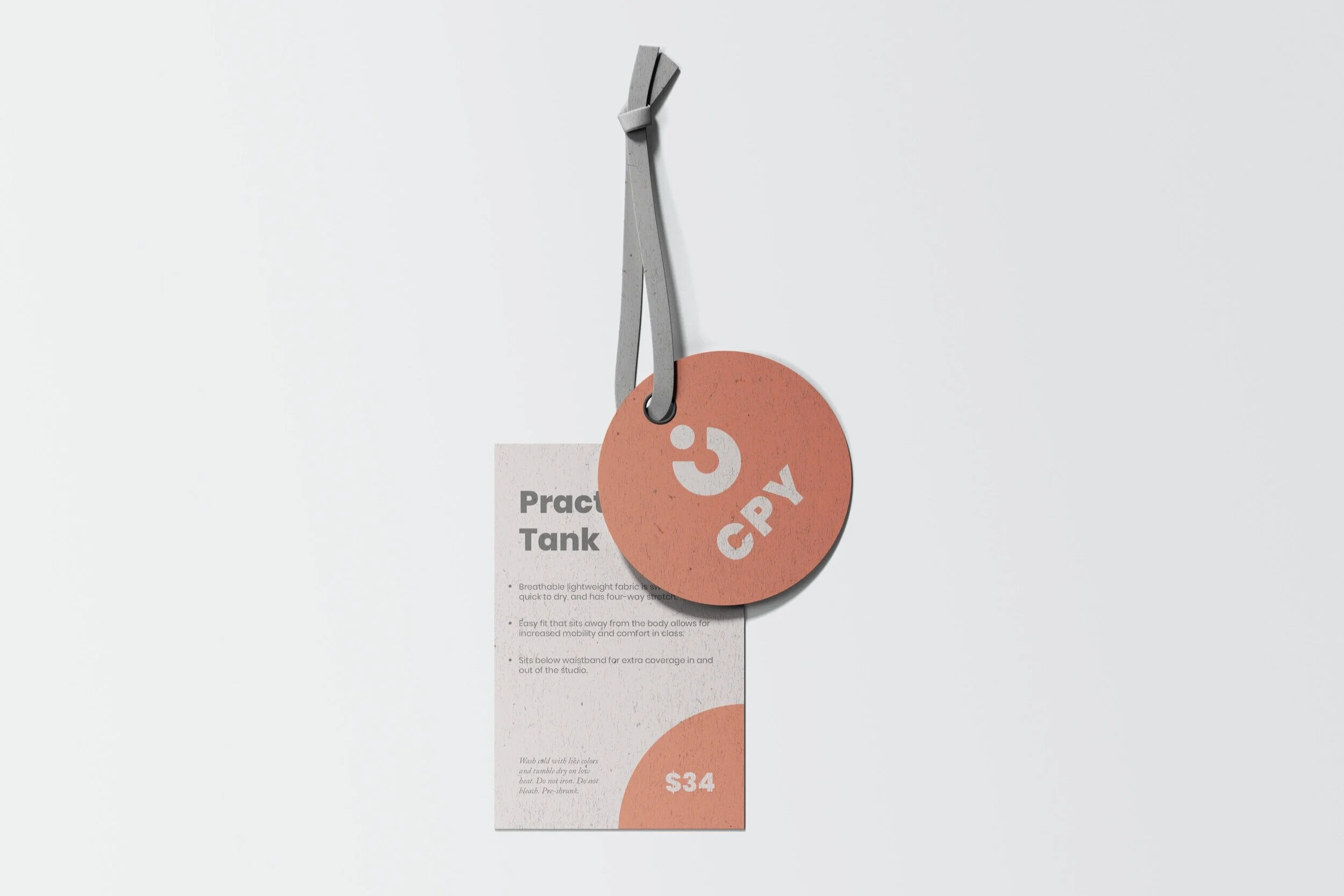
Rebranding with a focus on entry to yoga by using elemental shape language and imagery more clearly represents CorePower Yoga’s target audience.
Sketches
Logo Treatments
Native app
Insights
CorePower’s current app is more heavily focused on tracking a user’s fitness journey than on finding and booking classes. Users don’t need the app to sign up and book their spot for class; they do need the app for intention and goal-setting, accumulating “badges,” and reviewing completed classes. CPY’s target audience uses fitness apps to pre-book their spot in class, pay for class packages, and learn about instructors.
Goals
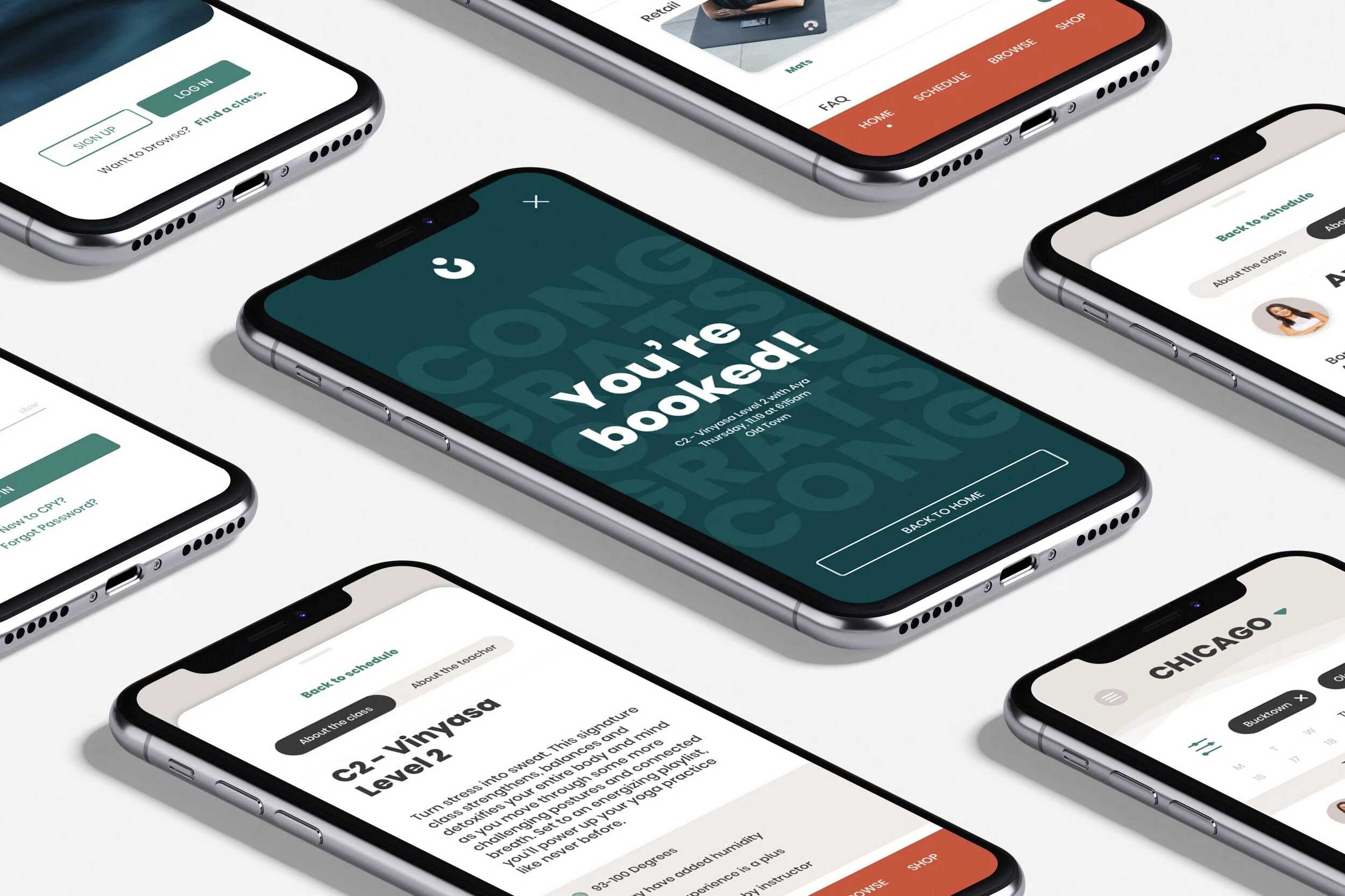
Design an app that is friendly, functional, intuitive, and brand resonant that focuses primarily on guiding the user through the process of browsing schedules and instructors, and selecting classes; supplementary features include shopping and purchase history, as well as studio announcements and account management.
How to book a class
Users click on “find a class” on their upcoming classes tile or “schedule” in the bottom navigation to search classes.
Filter any preferences and scroll through available classes.
Users can book directly from the schedule if they’re confident in their class choice, or click “view details” to learn more about the class and instructor, where they can also reserve their spot in class.
Once a class is reserved, the user will see a confirmation page with class details to review, and the ability to return back to home.
Using the menu and account tabs
Users can click the menu button from any of the bottom navigation tabs: home, schedule, browse, or shop.
The menu button will pull up a drawer with a main menu tab and an account tab.
Users can log out of their account on the app from either of the tabs in the menu drawer.
Checking in for class
The app will notify users to check in for class within 15 minutes of their class’ start time and when they’re geolocated close to the studio.
Opening the notification brings the user to the home screen where they can click “check in” if they are close to an upcoming scheduled class.
A drawer pulls up with an overview of their class information and a QR code that they can scan at the studio’s check-in desk; once they’re done, they can either slide the drawer down or click “back to home” to return to the home screen.


